Introduction
In data visualization, coloring arrows in comparisons is a powerful method to quickly communicate changes and trends in KPIs (Key Performance Indicators). This technique not only highlights performance metrics but also aids in interpreting complex data effortlessly.
The Significance of Arrow Coloring
Coloring arrows provides an intuitive way to interpret data trends:
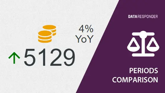
- Green Arrows: Typically indicate positive changes or desirable trends, similar to rising stock prices
- Red Arrows: Often used to denote negative changes, such as an increase in complaints or failures
- Yellow arrows: May signal situations of stability where changes are small enough to be neither good nor bad
- Gray arrows (no color): Used when we want to avoid imposing an additional interpretation beyond that of the direction of change, for example in the case of events that are not entirely within our control
Flexible Arrow Coloring in Data Responder
Data Responder offers flexible arrow coloring for KPI indicators to suit various business contexts. This flexibility allows users to:
- No Colors: For contexts where color-coding is not applicable or necessary
- Positive Growth: Green arrows indicate beneficial increases, such as a rise in sales or customer satisfaction
- Negative Growth: Red arrows highlight undesirable increases, like operational costs
- Positive constant: Green arrows are used where stability is required, while red indicates that any significant change may be cause for concern
This structured approach allows users to swiftly adapt visual cues to their specific operational or reporting needs, facilitating clearer and quicker interpretation of complex data sets.
Examples and Application
Data Responder’s arrow coloring configurations are strategically applied across various business processes:
- No Colors: In human resources metrics like the “number of employees retiring,” where the data should be presented without any bias or implied sentiment
- Positive Growth: For marketing campaigns, green arrows indicate a rise in lead generation or campaign effectiveness, suggesting a successful outreach strategy
- Negative Growth: In customer service operations, red arrows could signal an increase in complaint rates or response times, prompting a review and potential process adjustments
- Positive Constant: In production line management, green arrows show steady production rates are maintained, crucial for operational efficiency, while red arrows highlight disruptive fluctuations needing immediate action.
This tailored approach ensures that each business process utilizes visual indicators that best reflect their specific operational goals and challenges.
Conclusion
Effectively using colored arrows in data visualizations can transform how data is perceived and acted upon. In Data Responder, the ability to customize these colors according to the specific context of the data ensures that stakeholders can make more informed decisions, respond to trends more swiftly, and manage operations more effectively.