Introduction
Custom map charts are a powerful tool for visually representing data located on any surface. They allow businesses to spatially display information, making it easier to identify patterns, trends, and regional differences.
Understanding Custom Map Charts in Data Responder
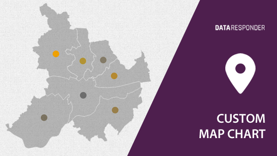
Data Responder’s custom map chart widget operates as a “linked widget,” meaning it aggregates data from pre-existing widgets. The chart uses uploaded base images, which could be geographic maps or custom schematics, enabling businesses to visualize their data spatially. Map data is represented by colored points, where the intensity of the color denotes the magnitude of the data. This enables quick comparisons and identification of regional indicators or areas of interest.
Step-by-Step Guide to Creating a Custom Map Chart
Follow these steps to create a custom map chart in Data Responder, allowing you to visualize your geographical data with ease and flexibility:
- Upload a Base Map or Schematic: Begin by uploading your custom map or schematic. This can be a geographical map for location-based data or any diagram relevant to your business.
- Link Data Widgets: Use the “linked widget” feature to connect your data sources. These data points will appear as color-coded markers on the map.
- Adjust data points: Modify the position of points to accurately reflect data values in their correct locations. Brighter points indicate higher values, making comparisons intuitive and easy.
Practical Applications of Custom Map Charts
Custom map charts can be used in a variety of business scenarios to visualize spatial data and enhance decision-making efficiency:
- Sales Performance by Region: Visualize sales performance across different regions, using color intensity to represent revenue levels. This helps pinpoint high-performing areas and regions needing attention.
- Customer Distribution: Map customer distribution geographically, displaying where most clients are concentrated. This information aids in logistics planning or marketing efforts.
- Supply Chain Optimization: Represent warehouse locations and their performance metrics spatially. Color intensity can indicate warehouse efficiency or stock levels, providing actionable insights for optimization.
- Event or Incident Tracking: Track incidents, outages, or events geographically to identify clusters or recurring issues, aiding in faster resolution and resource allocation.
Conclusion
Data Responder’s custom map chart widget provides a versatile way to represent spatial data visually. Whether you’re analyzing sales performance, customer distribution, or operational efficiency, this tool helps simplify complex data, offering deeper insights and enabling faster decision-making.

