Introduction
Funnel charts are an essential tool for visualizing processes that involve sequential stages, such as sales pipelines or conversion rates. They help highlight where prospects drop off and where the process can be optimized, providing clear and actionable insights.
Understanding Funnel Charts in Data Responder
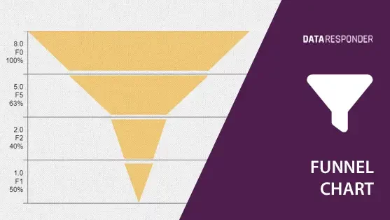
In Data Responder, the funnel chart widget allows users to visualize data flow through stages such as lead generation, qualification, and sales conversion. Each stage narrows, reflecting drop-off rates and helping identify bottlenecks. As a “linked widget,” the funnel chart doesn’t refer directly to source data but aggregates information from linked partial widgets. These individual widgets can be displayed separately on the dashboard or hidden beneath the funnel chart, which always appears on a higher layer for a cleaner, more streamlined layout.
Funnel Chart Structure
Funnel charts are structured hierarchically, with the widest part at the top representing the initial stage (e.g., total leads) and the narrowest part at the bottom representing final outcomes (e.g., completed sales). Each segment of the funnel shows the percentage drop from one stage to the next, giving a visual summary of the entire process.
Practical Applications of Funnel Charts
Funnel charts are highly valuable in various business contexts:
- Sales Pipeline Visualization: Track the number of leads through different sales stages – from initial contact to closed deals – enabling better resource allocation and follow-up strategies.
- Marketing Campaign Performance: Visualize the conversion rates of marketing campaigns by tracking how many prospects move from awareness to engagement and, eventually, to purchase.
- Customer Support Processes: Use funnel charts to track support tickets through stages like initial inquiry, response, resolution, and feedback collection, helping to streamline customer service operations.
- Product Launch Analysis: Evaluate the success of a new product launch by tracking how many users proceed through product awareness, trial, and full adoption stages, helping to adjust marketing and sales strategies.
- Recruitment Process Tracking: Monitor the hiring pipeline, from applications received to successful hires, allowing HR teams to identify stages where candidates drop out and optimize hiring strategies.
Conclusion
Funnel charts in Data Responder provide a clear and actionable view of sequential processes, making it easier to spot inefficiencies and improve decision-making. Whether tracking sales conversions or evaluating the effectiveness of a marketing campaign, funnel charts offer the insights you need to optimize each stage of the process.

