Introduction
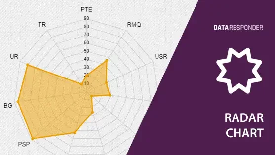
Radar charts, also known as spider or web charts, are a powerful tool for displaying multivariate data in a way that highlights performance across various metrics. They are especially useful for comparing multiple items or variables graphically.
Understanding Radar Charts in Data Responder
Data Responder’s radar chart widget visualizes aggregate data from multiple pre-existing widgets, categorizing it as a “linked widget.” This allows users to effectively integrate and compare complex data sets. While the individual widgets that supply data to the radar chart can be displayed separately on the dashboard, they can also be hidden beneath the radar chart widget, which always appears on a higher layer for clearer visualization.
Differences Between Radar and Polar Charts
Radar charts can illustrate a company’s performance across different areas like sales, cost efficiency, and customer satisfaction, showing strengths and weaknesses relative to each other. Polar charts, using the same business data, might display how these metrics evolve over time, such as quarterly growth, giving a directional view of performance trends from a central baseline. Both charts offer visual insights but focus on different aspects of the data.
Practical Applications of Radar Charts
Radar charts are invaluable in various business processes:
- Cost Analysis: Examine different company expenditures such as rental costs, payroll, and marketing expenses, providing a comprehensive view of financial allocations.
- Revenue Analysis: Aggregate revenue from different product groups, such as hardware sales, license sales, and various service offerings like maintenance, implementation, and training.
- Goal Achievement: Display the percentage of goals achieved in different operational areas, such as sales targets, service efficiency, and financial stability.
- Sales Comparison Across Branches: Use radar charts to compare sales performance across various dispersed branches of the company.
- Performance Analysis: Deploy radar charts to visualize performance metrics across multiple strategic business units. Position key performance indicators (KPIs) on different axes to illustrate where each unit excels or needs improvement.
Conclusion
Radar charts in Data Responder offer an easy way to visualize complex data sets, making them essential for strategic decision-making where comparisons are crucial.

